Medisas Medical App
2016 - 2017
Medisas is a workflow and communication tool for hospitals. It sits on top of a hospital's electronic medical record (EMR) to make it easier for care teams of doctors, nurses, and case managers to coordinate care. Medisas prevents medical mistakes. This helps patients return home sooner, ultimately saving lives.
In my time at Medisas, my work included:
Mobile and web visualizations for laboratory data
An overhaul of the architecture of the web application, resulting in a new navigation design
Mobile and web forms for admitting patients to a hospital
Developing a product development process
Field research at hospitals across the country
Recruiting and managing two full-stack designers
Much of this work is confidential, but I am able to discuss it in-person.
Project: Lab data visualization
Summary
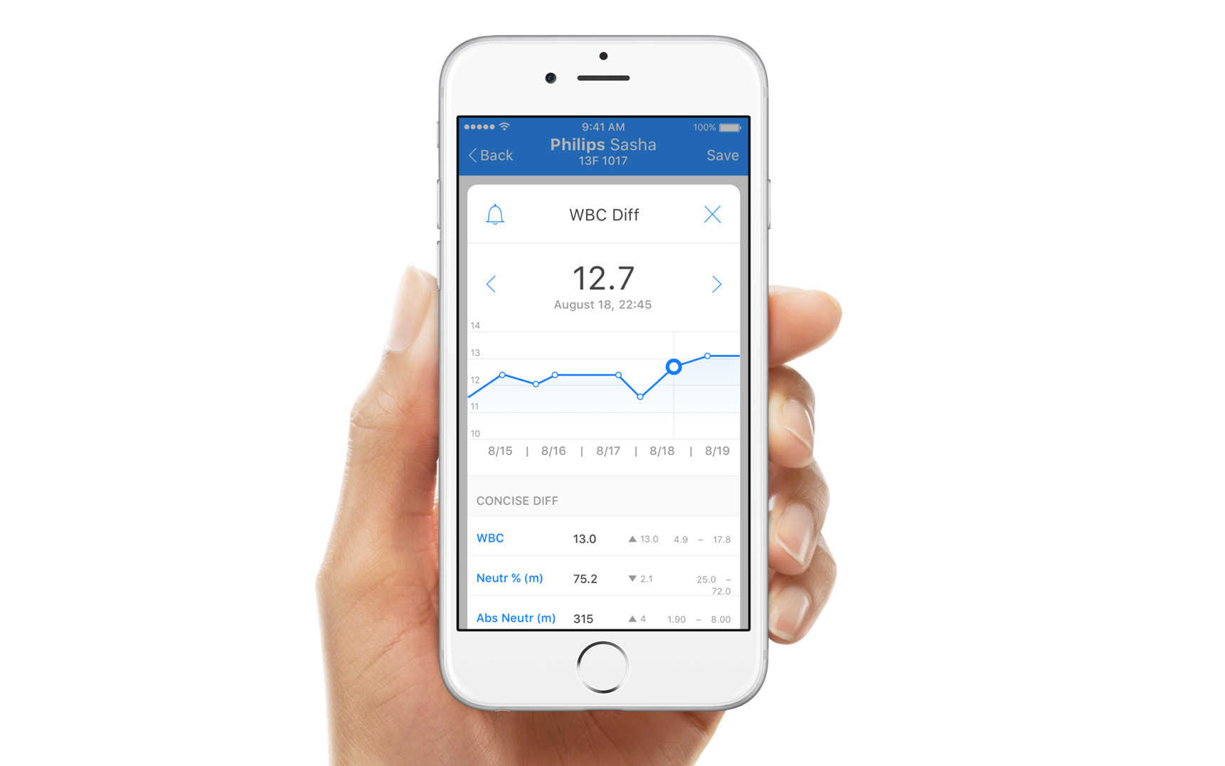
The original design worked when doctors were manually inputting a small number of lab values, but became unusable when hospitals started sending electronic feeds of information.
Screenshots from before
The section becomes long and difficult to navigate when a patient has been hospitalized for many days.

Problems identified through field research
Patients who have been in the hospital for weeks can have 150+ lab results, making it hard for doctors to find the information they're looking for.
Data is not organized in a way that is easy to navigate.
It's too difficult to find and understand data trends.
Who has these problems?
Providers who are pre-rounding and want a quick overview of new and abnormal data
Providers who are rounding and need quick access to new data that wasn't available pre-rounding
Providers who are waiting for results after rounding, and are wasting time constantly checking for updates
User quotes about original design
“The challenge with Medisas is that you can only get 1 data point.”
"Too much random stuff in Medisas, need to scroll a lot"
Design Principles
Support efficiency while allowing for discovery: Providers are often on the hunt for particular information, so make that easy to find. At the same time, we shouldn’t streamline the interface so much that we accidentally obscure important information.
Let their eyes filter it: Just like a pilot can visually filter important information from a sea of indicators, we should assume that our users are experts who can “eyeball the data” if it’s in the right format.
Progressive disclosure: Have an opinion about what’s most important, and allow the users to do some work to dig deeper if they want to see the details.
Eliminate busywork: Design the system to reduce manual work like checking for new labs, cutting and pasting lab data into the investigations section, and manually starring/unstarring lab values.
Have the numbers tell a story: Give the data in a way that providers can understand. Create a logical hierarchy of information, with categories of data that map to providers’ mental models.
Modes of Use
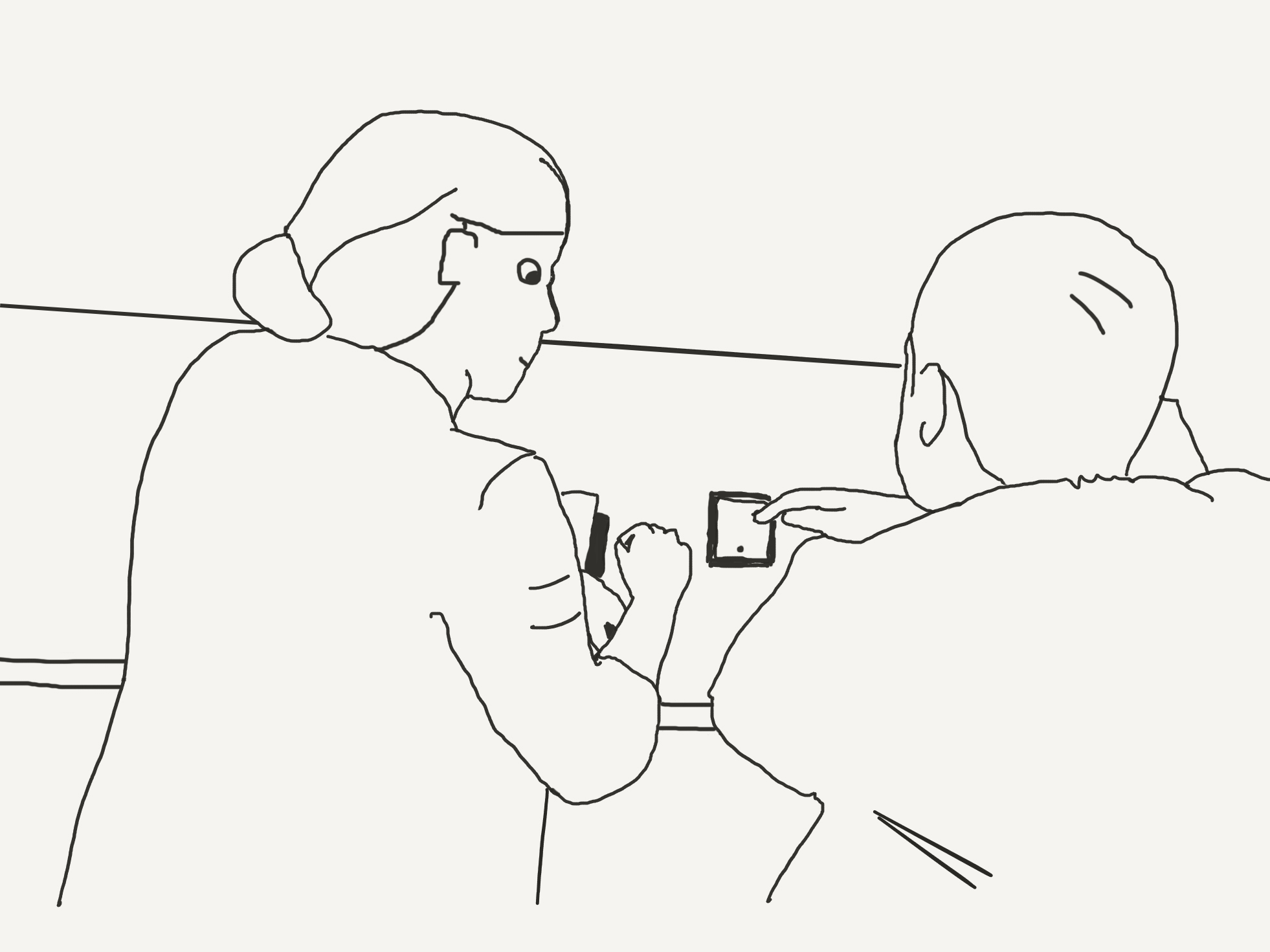
Based on interviews, I put together a framework of how people use the app, and features we could build to support these modes.

Brainstorming & Sketches
Based on initial field research, and the framework and modes of use we were committed to supporting.

User Testing
Done with InVision prototypes in-person and by phone.
Feedback
Most data is only helpful if it's recent
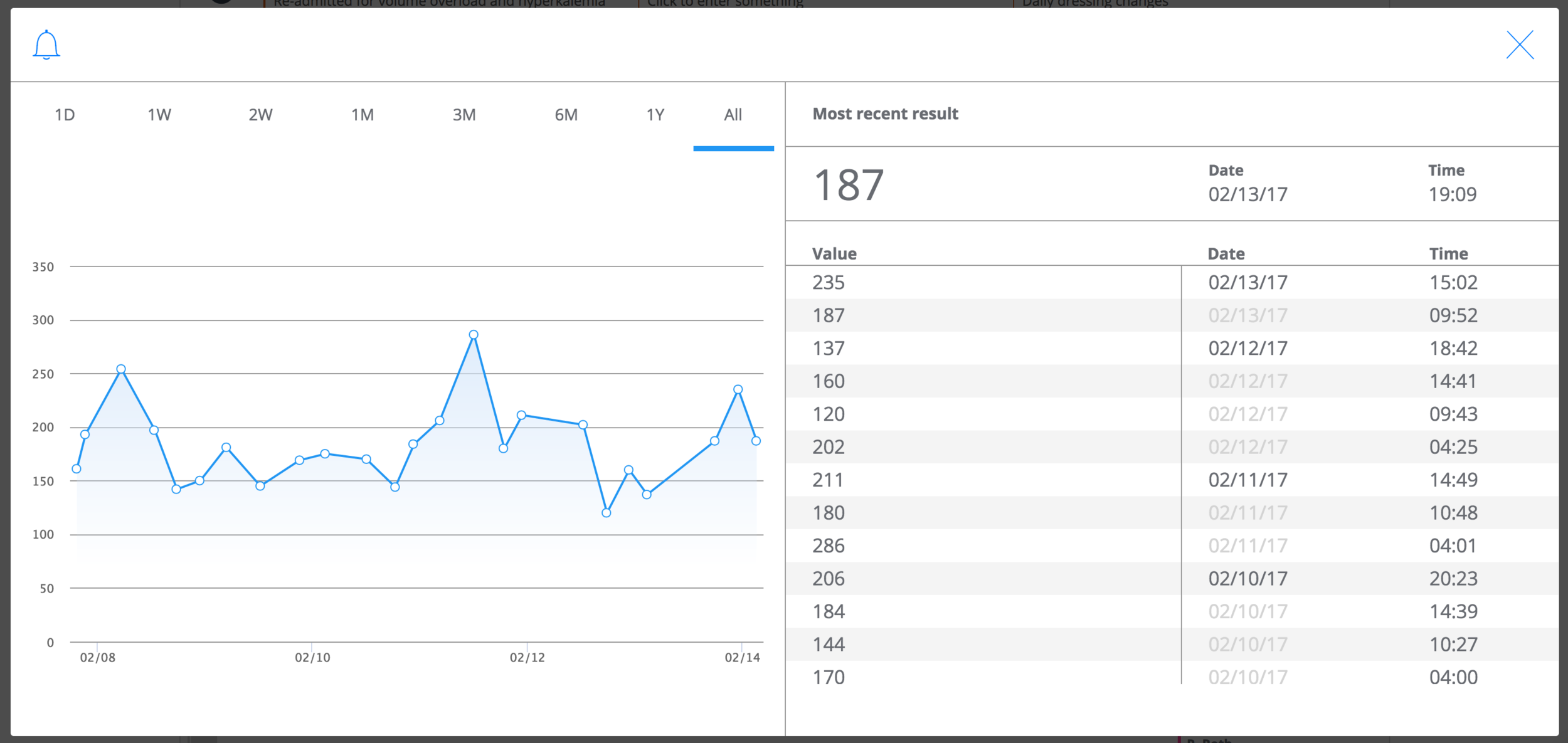
Doctors like gradual disclosure of information: hover to see a few values, click to see an entire graph
Doctors use the computer to look up detailed information before rounds
Doctors use their phones to check for new results
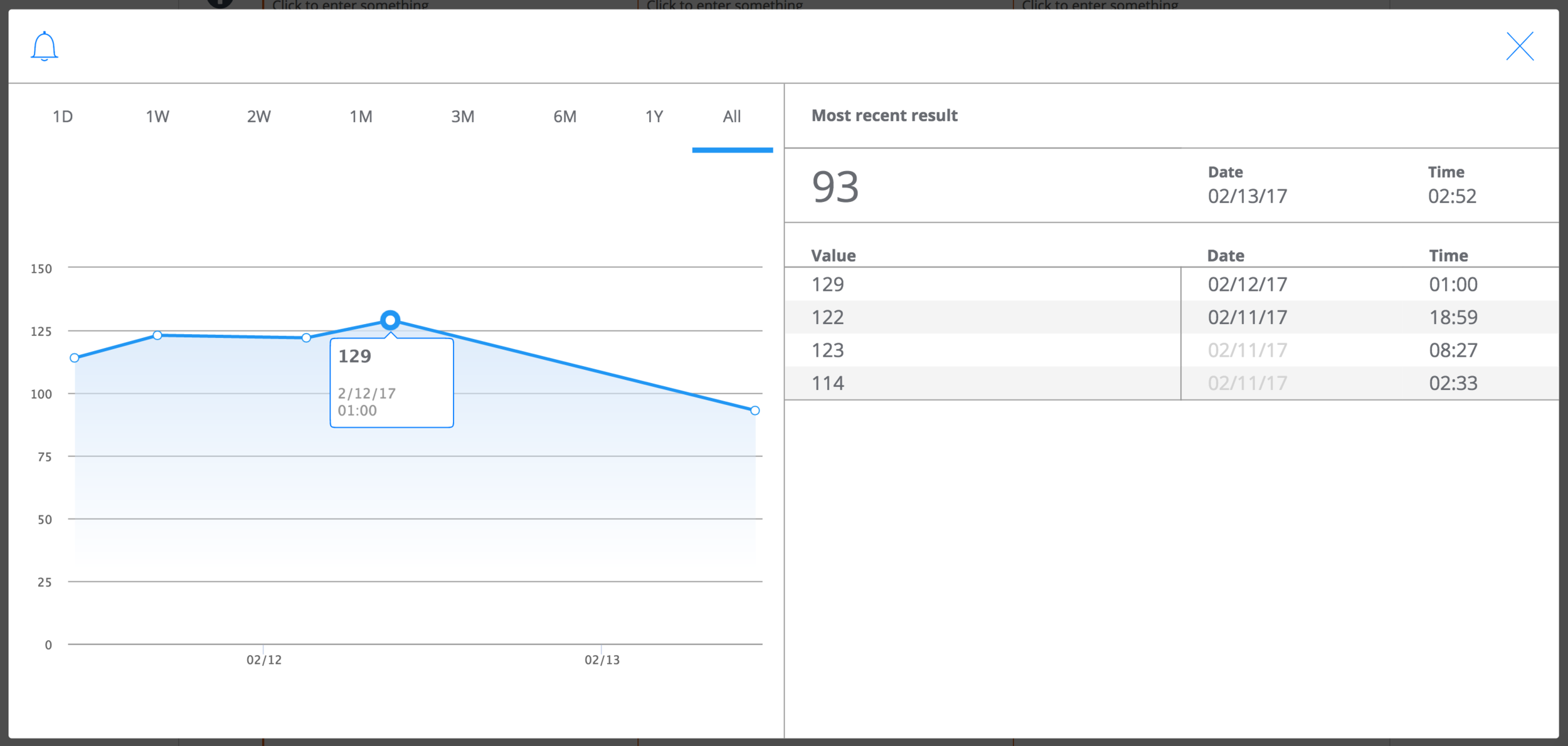
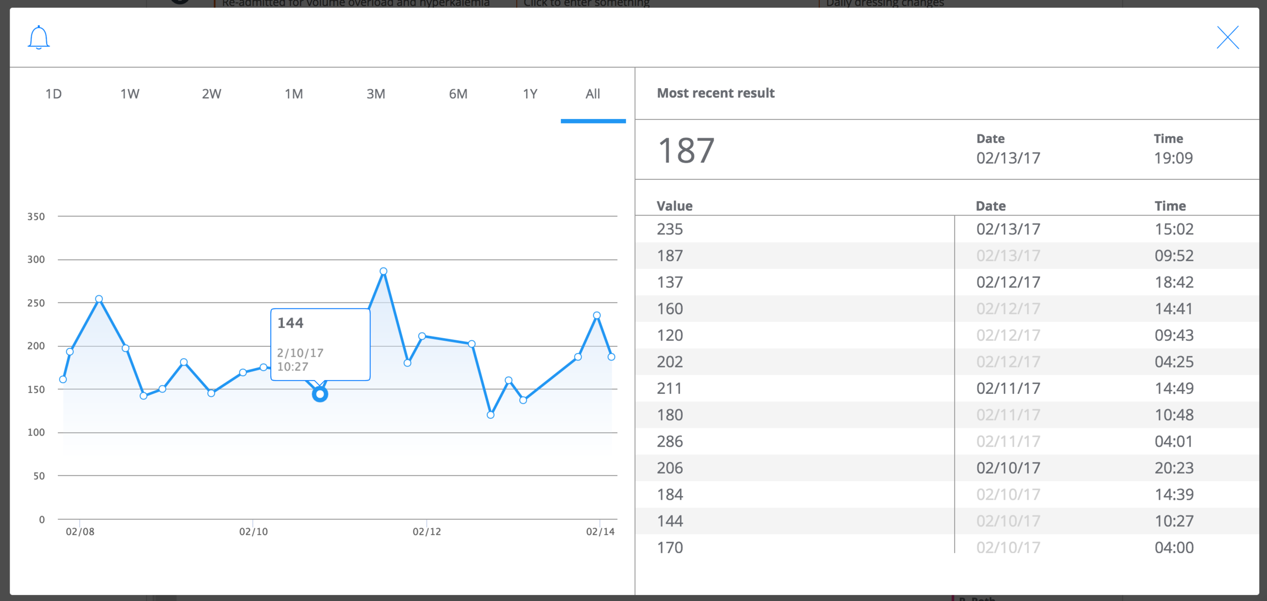
Designs
I worked with our engineering team throughout the development process, and produced dozens of annotated mocks for them to reference when building.

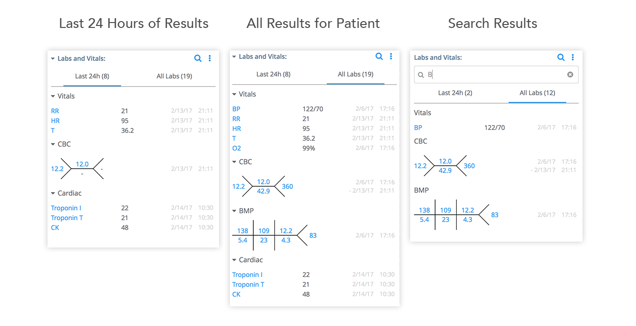
Live product
Web has launched, and mobile is in the process of being built. Here are screenshots from the earliest changes to the web dashboard and modals.
Metrics & Measurements
We measured success in both qualitative and quantitative ways, and used data to help refine the product.

I had engineers write queries to pull data logs using Sumo Logic, and we set up data tracking for key features using Mixpanel
Quantitative data
Usage for the web was heaviest in the morning pre-rounding, and had another spike as doctors check for new labs after lunch.
The search feature was not very discoverable, but had moderate usage across a number of users
Few people used the interaction collapsing labs, indicating that we may want to eliminate the feature
Most providers want to view one week's worth of lab values, meaning that we should default graphs to showing the past 7 days
Qualitative feedback
“Labs looks nice, it’s REALLY nice. Whoever put this together was really paying attention and thinking.”
"This is really nice. The fact that it just shortens it, it makes it more concise. This is tremendous I think. I don’t really look at the older labs.”
"You’ve taken a very challenging part of our EMR and turned it into something much more user friendly.”
"In a lot of other programs, you have to click extra to get this trend. It’s nice to see the trend, and have all the numbers next to it"